Gold Souk
Redefining shopping center design
Part of the largest indoor market in Europe, the Gold Souk is a remarkable shopping center that caters specifically to jewelry shops and gold traders. When considering the design of a shopping center, one might wonder what it should look like and what design themes could be incorporated. To answer these questions, we conducted extensive research on shopping centers around the world.
Exploring diverse facade designs in shopping malls
During our investigation, we observed various exterior design themes among different malls. Some malls featured facades that showcased esthetic compositions, while others functioned as massive billboards, proudly displaying renowned brand names. Additionally, we encountered malls that drew inspiration from classical structures, incorporating elements such as Egyptian sphinxes, the Arc de Triomphe, magnificent fountains, and even Venetian canals. It became evident that the design of shopping center facades often had little correlation to the types of shops housed within.
Form follows identity
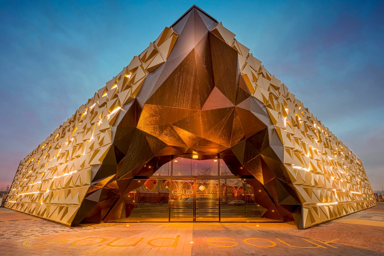
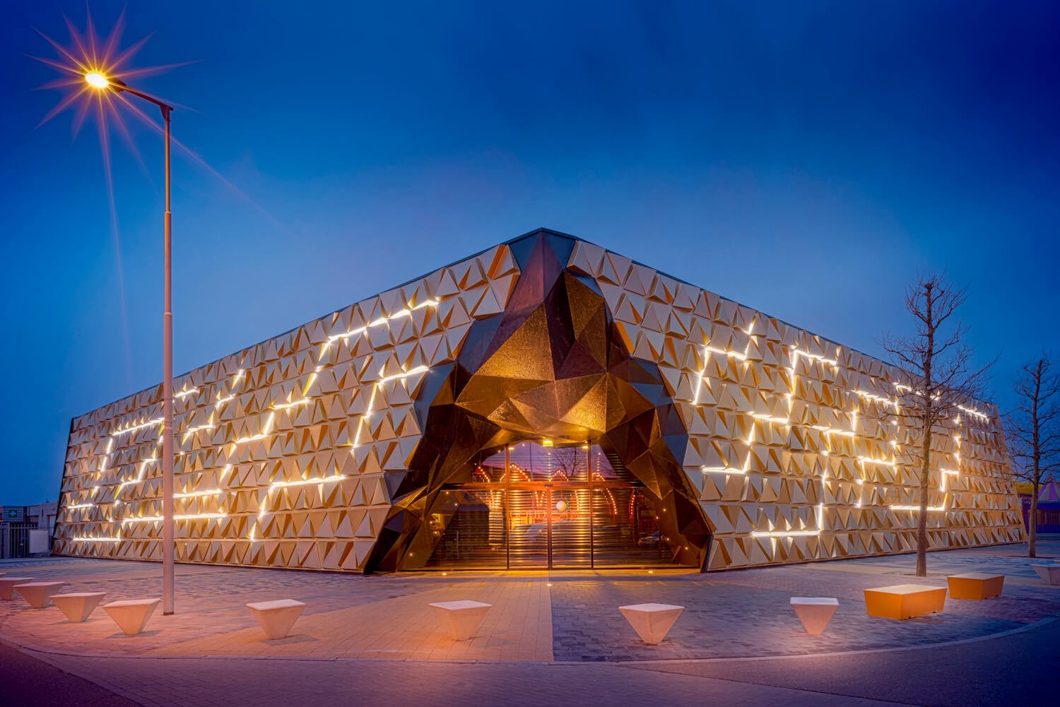
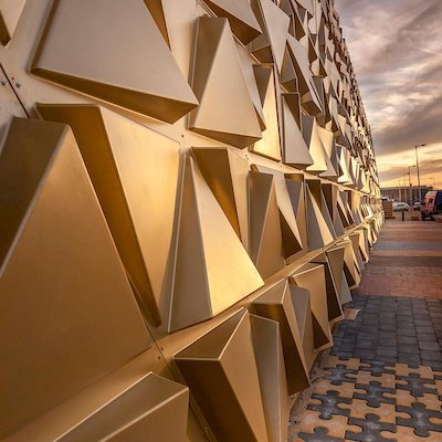
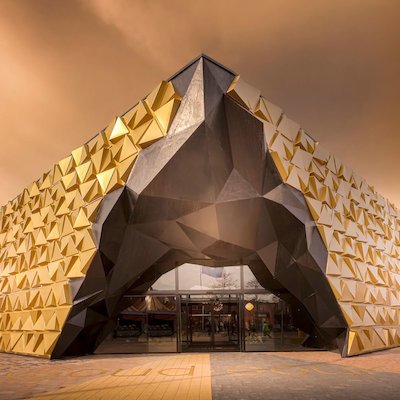
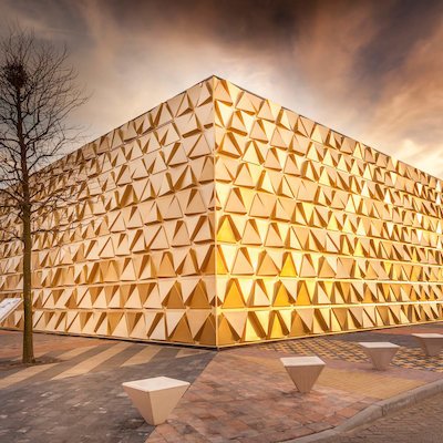
Considering this information, we strove to create a visually stunning exterior for the Gold Souk, situated amidst thirty other shopping centers in the vibrant Bazaar Beverwijk. Understanding that the Gold Souk primarily targeted individuals interested in purchasing jewelry and gold, we conceived a shiny gold faceted facade intended to elicit exclamations of wonder and awe. Our aim was to emanate an atmosphere of joy and opulence, enticing visitors inside and putting them at ease to enjoy a relaxed and luxurious shopping experience.
Enhancing visitor experience at Gold Souk
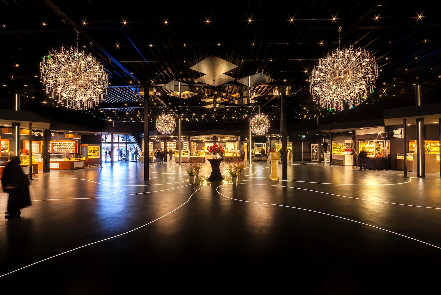
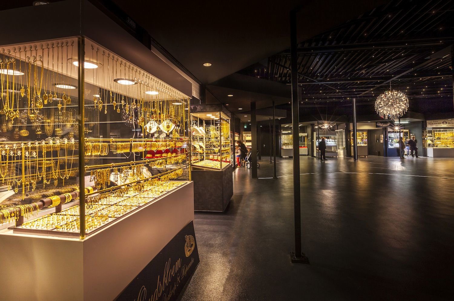
While exploring various shopping centers, we noticed that many were similar in design, making it challenging for visitors to navigate through their indoor streets without the assistance of maps. To address this issue, we sought to minimize the energy spent on wayfinding, allowing visitors to allocate more of their attention to discovering the items they wished to purchase. To fulfill this objective, we devised an innovative layout for the Gold Souk—an open square surrounded by all the shops. Upon entering the Gold Souk, visitors immediately have a clear view of all the shops, eliminating the need for maps. The interior ambiance of the Gold Souk is characterized by dark hues, accentuating the brilliance of the jewelry on display. The lighting is both sparkling and dimmed, creating a tranquil and inviting environment where visitors can leisurely explore and uncover the treasures within the Gold Souk.
Location Beverwijk, The Netherlands
Client De Bazaar, Beverwijk
Year 2014
Status Completed
Program Retail
Collaborators Leaders against routine - Barbara van Veen
Photography Hannah Anthonysz
